Overview
Wrapping the InvenioRDM deposit form
The package provides a custom Jinja template that renders a custom version of the top-level RDMDepositForm component. This is a thin wrapper that renders the stock DepositFormApp as its one child. The modular form layout and configuration are merged into the stock deposit form’s config data by the template (using a custom filter) and passed into the stock form’s Redux store.
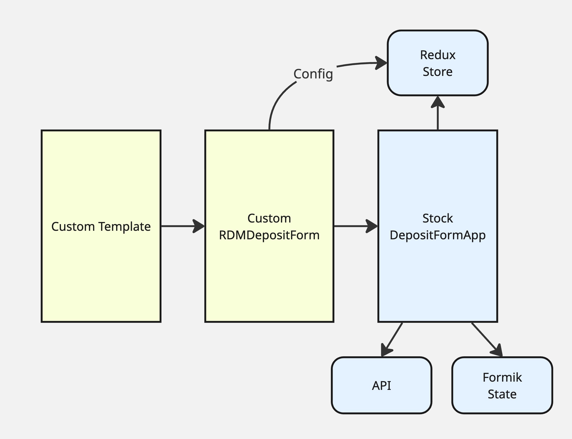
The stock invenio-rdm-records component retains responsibility for:
Creation and management of Formik form state (monitoring input values and “touched” states)
Communication between the form and the backend API
Creation and management of the Redux store that handles static data and configuration
Inserting the layout layer
The second role of the custom RDMDepositForm is to insert a new custom layout layer between the DepositFormApp and its children (the individual form field components). The wrapper component renders DepositFormApp with one child: the new FormLayoutContainer component.
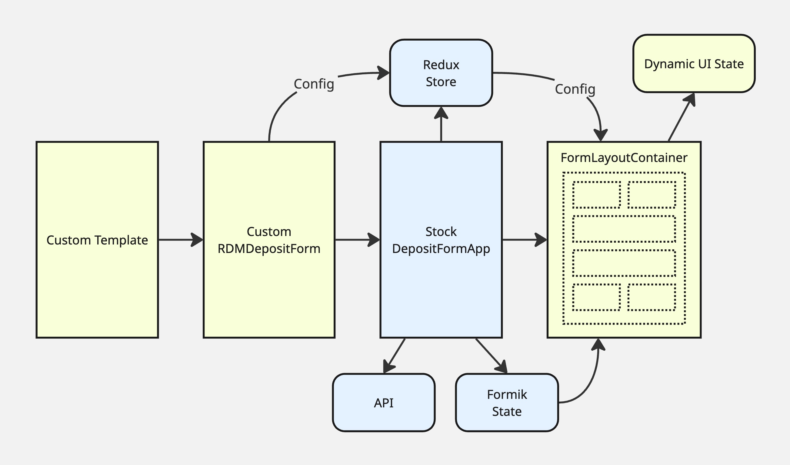
This layout layer (and its children) has access to the Redux store and Formik state but does not manage them.
The FormLayoutContainer is responsible for:
Creation and management of dynamic form UI state (via a dedicated Reducer), including the selected resource_type for selective per-type field display
Handling client-side autosave of form data
Managing page navigation through the form (for multi-page layouts)
Monitoring form error states and displaying them on the page (including merging server-side errors with client-side validation errors)
The registry of available form field components and their visual arrangement (including pagination) is provided via the Redux store. The FormLayoutContainer renders the top-level FormPage elements. If the configured layout includes multiple pages, it also renders a stepper component above the form page and a footer with forward and back buttons.
Rendering form fields in the layout
Following the configured layout, the FormPage elements render the individual form field components. These can be the stock field components supplied by invenio-rdm-records or new custom components; both can be included in the layout configuration.
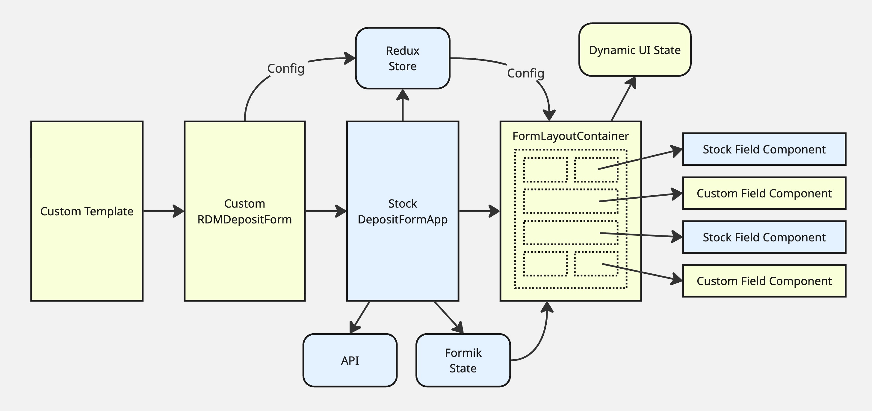
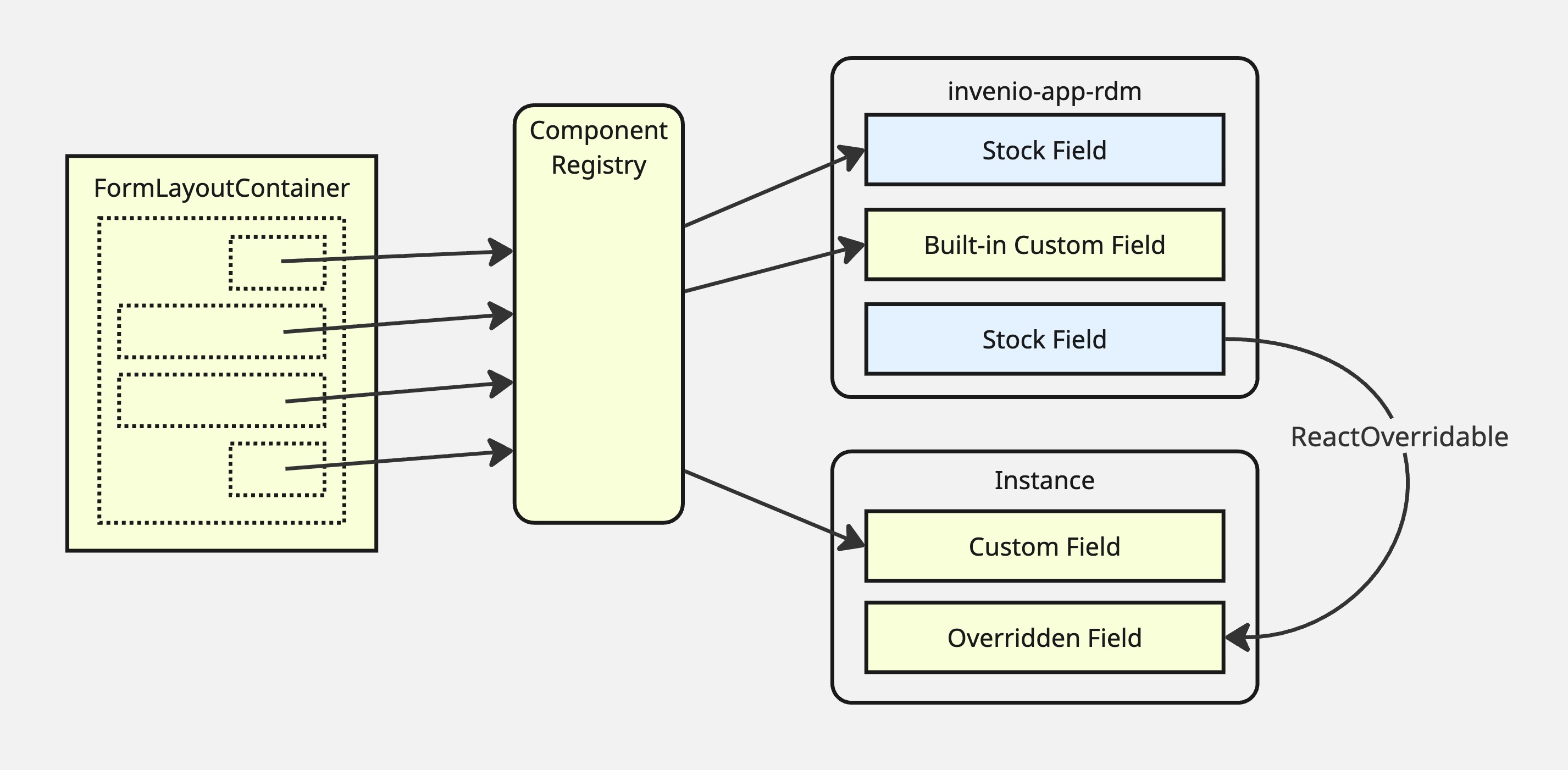
Combining a variety of field component sources
This package maintains a file-based registry of components available for use in the configured layout. That registry can also be expanded via an additional registry in your local InvenioRDM instance folder, supplied to invenio-modular-deposit-form through a Python entry point.
All of the stock field components are present in the combined registry by default. The stock components can also be overridden via the usual ReactOverridable method from your local instance directory. You can use your local instance component registry to add completely new custom form field components (e.g. compound components that combine multiple form fields in a single widget, or multiple components linked to the same underlying metadata field).
It is also possible to include any custom fields in any location in your layout. This package provides individual components for all of the built-in custom fields that invenio-rdm-records provides for journals, theses, etc. If you create your own custom fields using the standard custom_fields approach, you can include field components for those custom fields through your instance’s component registry.
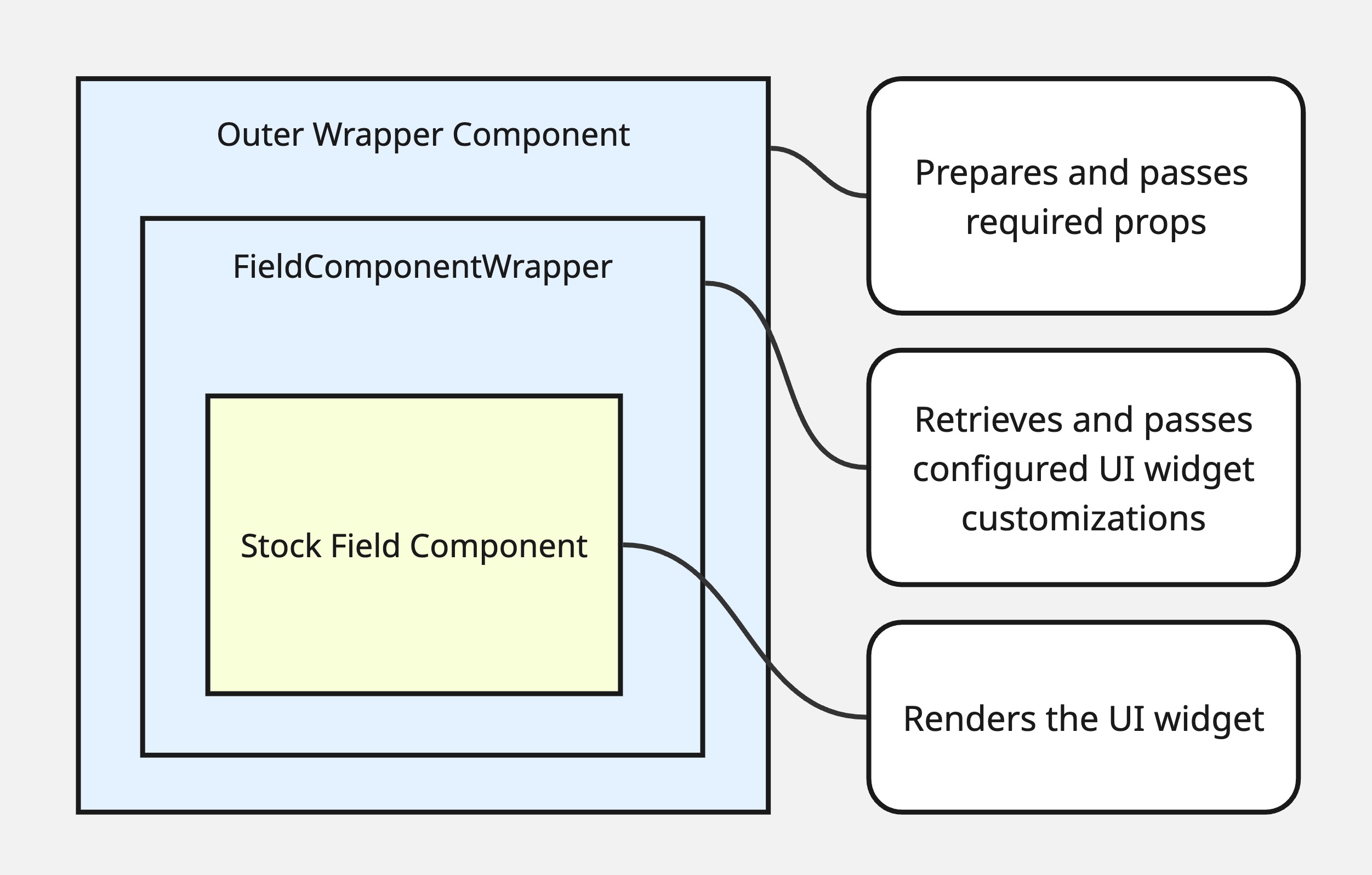
How form fields are inserted
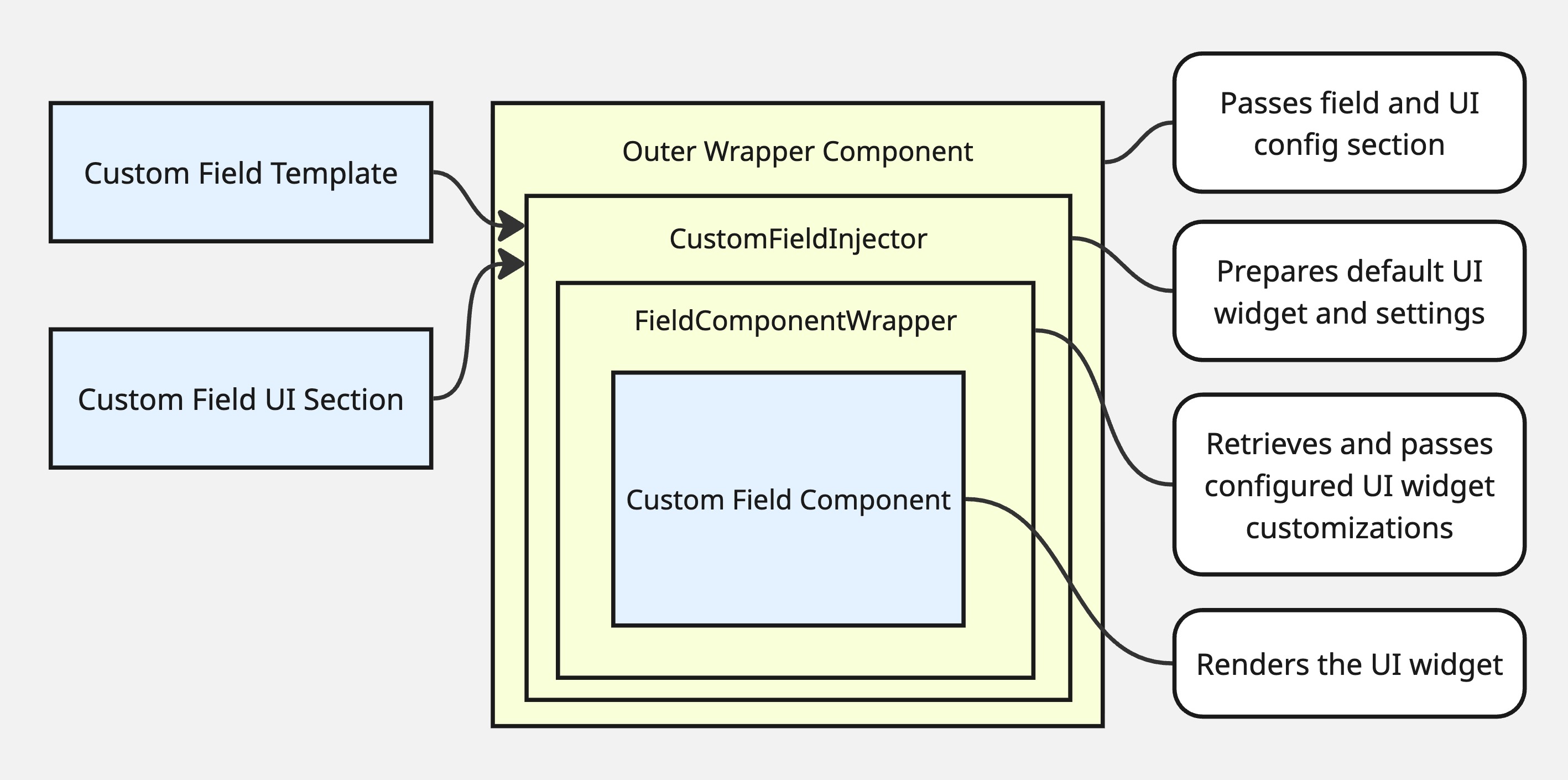
The stock InvenioRDM deposit form uses a static layout in which required props and configuration are passed directly from the DepositFormApp into each field component. To insert these field components into a flexible layout layer, the extension uses an outer wrapper component for each field that retrieves and fetches the props the field would normally receive from its parent (the record, list options, rich text editor settings, etc.).
In addition, the field component is wrapped in an inner FieldComponentWrapper higher-order component. This retrieves any configured properties for the form field UI (label, labelIcon for the field label icon, placeholder, etc.), modified as necessary for the currently selected resource_type, so that field widgets can adapt to the resource_type on the fly without page reloads.
For custom fields (built-in or user-created), the field’s React component requires props prepared by a dedicated field template. Custom fields also have their UI configuration embedded in form UI sections, displayed in the stock form as tabs at the bottom of the form.
To free up custom field widgets for more flexible placement, use the CustomField component. It looks up the field’s widget and props from the same custom field UI configuration that is part of the regular InvenioRDM custom fields system (see Handling custom fields in Extending), does not mutate that config, and wraps the result in FieldComponentWrapper. This allows the field’s UI properties to be modified from the layout config and lets the widget adapt to the selected resource type.